How to Get Your YouTube Thumbnail Size Right Every Time
YouTube thumbnail size requirements, file formats, safe zones, and resizing steps help you create sharp previews that stand out and earn more clicks.


Chapters
In short
YouTube thumbnails are preview images that need the right dimensions, format, and framing to look clear before someone clicks. Use a 16:9 image, ideally 3840 x 2160 or practically 1280 x 720, keep it at least 640 pixels wide and under 2MB, and choose JPG or PNG. Clear, high-contrast designs with readable text, safe spacing, and a well-lit subject work best on mobile and desktop.
Picture scrolling through a feed where every video looks the same. The thumbnail is what makes someone stop, and getting its size right is the first step toward that moment.
Thumbnails are the small preview images viewers see before they click, so the dimensions, file type, and framing all matter.
This guide gives you the clearest, most complete answer on YouTube thumbnail size: the exact dimensions, file requirements, safe zones, and how to resize and test your image.
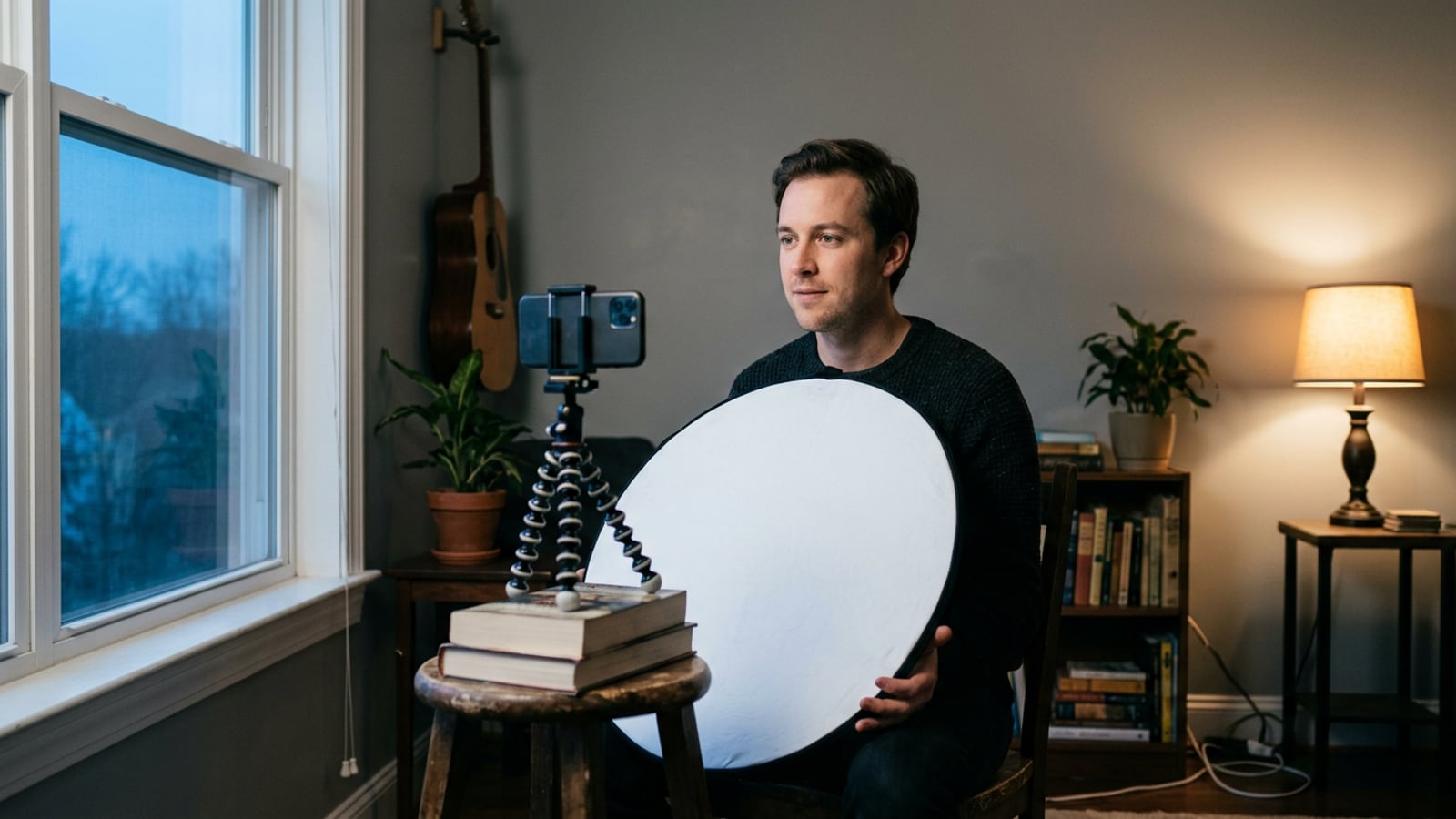
We’ll also show you how to shoot thumbnail-ready stills while you film, with lighting and framing that work from the start, so you’re not fixing a bad photo after the fact.
What Is the Ideal YouTube Thumbnail Size?
Here’s the short answer for 2026: build your thumbnail at 3840 x 2160 pixels in a 16:9 aspect ratio (the width-to-height shape of a widescreen video), saved as a JPG or PNG, according to a 2026 spec guide for YouTube thumbnails.
The sizes below explain what each number does and what you can fall back on.
Stick to 1280x720 pixels
Think of a course creator who builds every thumbnail at 1280 x 720 pixels. It’s big enough to look crisp on a laptop and easy to shrink for a phone. The sources we checked don’t name this as Google’s official spec, so treat it as a practical target.
The 2026 guide recommends building larger, at 3840 x 2160, so you can scale down rather than blow up. At 96 pixels per inch, 1280 x 720 works out to about 33.9 x 19.1 cm when printed.
Why a 16:9 ratio matters
Your aspect ratio is the shape of the frame. Google’s guidance on custom thumbnails keeps it simple: “For videos, try to upload a thumbnail with an aspect ratio of 16:9.”
That’s the same shape as the video player, so your face and text land where viewers expect them. It also gives you a widescreen look that reads as a real video, not a square photo.
Picture a streamer who crops a square webcam still into a thumbnail. Her face ends up pushed against the edge. A 16:9 frame keeps her centered and gives the title room to breathe.
Don’t go below 640 pixels wide
The 2026 spec guide lists a minimum width of 640 pixels. Go smaller and the image turns soft once the platform stretches it.
A 640-pixel file also holds its detail on small screens, which matters because thumbnails often show up tiny in sidebars and phone feeds.
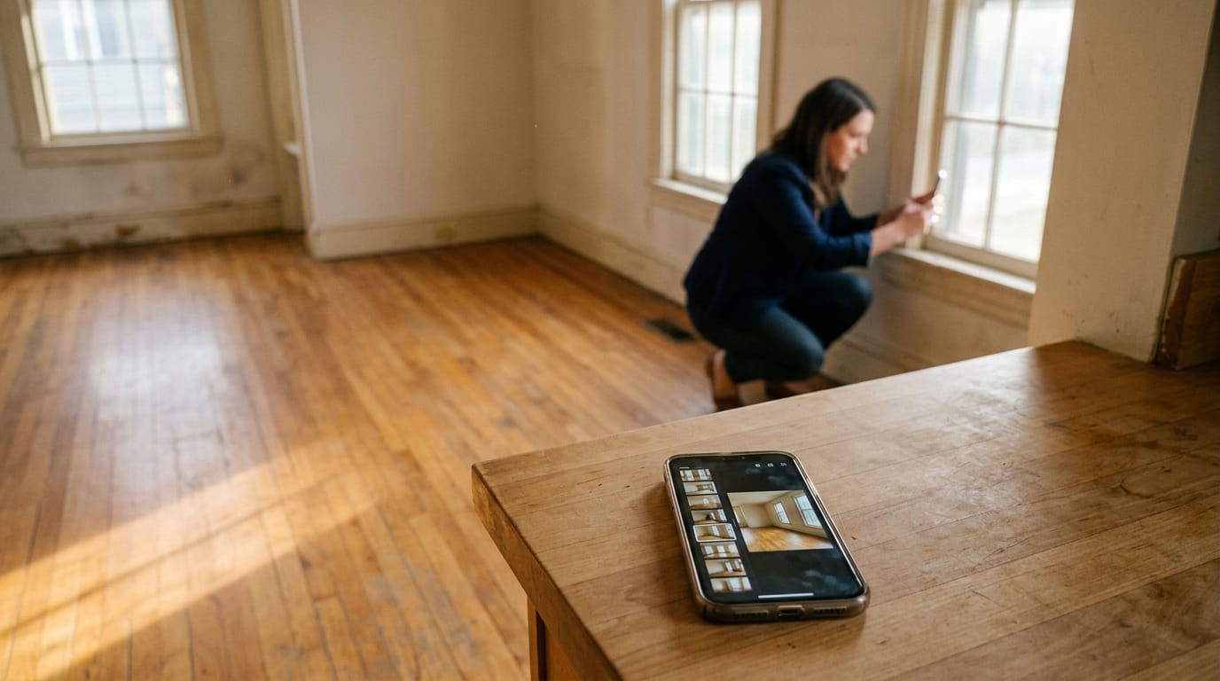
Picture a real estate agent filming a listing walkthrough on a phone. A still at 640 pixels wide stays sharp in the sidebar, where buyers scroll past it in a second.
Other sizes that still work
1920 x 1080 also works. It shares the same 16:9 shape and is a smaller full-HD option, about 50.8 x 28.6 cm at 96 pixels per inch.
2560 x 1440 is a different case. YouTube’s channel banner tips say, “We recommend that your banner image be at least 2560x1440 px to achieve the best display on all devices.” That’s for channel art, not video thumbnails, so keep it for your banner.
At 96 pixels per inch, it measures about 67.7 x 38.1 cm.
File Size and Format Requirements
Your thumbnail can look great and still get turned away, so it helps to know the rules before you hit upload. Here’s what matters most for file size, format, and the reasons uploads get bounced.
Keep your file size small
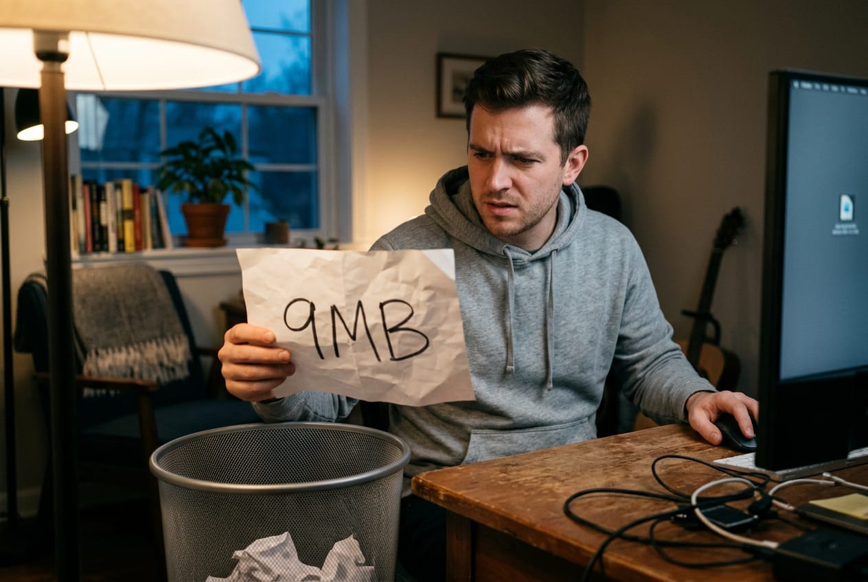
YouTube’s help center sets a 2MB cap on video thumbnails, and podcasts get a 10MB limit. Think of a streamer who exports a 9MB still straight from their camera. It fails. They re-export it at a smaller size, and it uploads on the first try.
Smaller files also keep load times fast, so your video page feels quick for viewers.
Which file formats YouTube accepts
We recommend JPG for most thumbnails. Here’s how the options compare:
- JPG: our recommended format, and it keeps files smaller.
- PNG: the choice when you need fine detail or transparency.
- GIF: supported.
- BMP: sometimes listed as accepted, but JPG is the safer bet.
Why YouTube rejects your upload
Most rejections come down to three problems:
- Oversized file: anything past the 2MB cap gets refused.
- Wrong aspect ratio: the image shape doesn’t match what YouTube expects.
- Unsupported format: a file type outside the list above.
Check all three before you hit upload. It’s a quick look that saves you a rejected file.
Making and Resizing Your Thumbnail
Your thumbnail is the first thing viewers see, so get the file right before you upload. Here’s how to design it, resize it, and add it in YouTube Studio.
Use templates to design faster
Start from a pre-made template instead of a blank canvas, then tweak the customizable fonts and colors to match your channel. A stock image library covers backgrounds you don’t have on hand, and once a layout works, duplicate the saved design.
Take a podcaster filming a weekly episode: she duplicates last week’s thumbnail, swaps in a fresh guest photo, and is done in minutes.
Shoot extra stills while filming, too. Grab a few frames where the light is flattering, so you have a usable photo ready instead of fixing a dim one later.
How to resize images correctly
Your image needs to be 1280x720. If it’s a different shape, auto-fill can match it to that size for you.
- Crop trims the edges
- stretch distorts the picture (avoid that with faces)
- fill frame fits the image to the whole area
Want everything visible? Use the padding option to add borders.
Balance resolution against the 2MB file limit: you want the image sharp enough to look crisp, but small enough to stay under 2MB. Browser-based tools let you do all of this without uploading the file anywhere extra.
Uploading your thumbnail in YouTube Studio
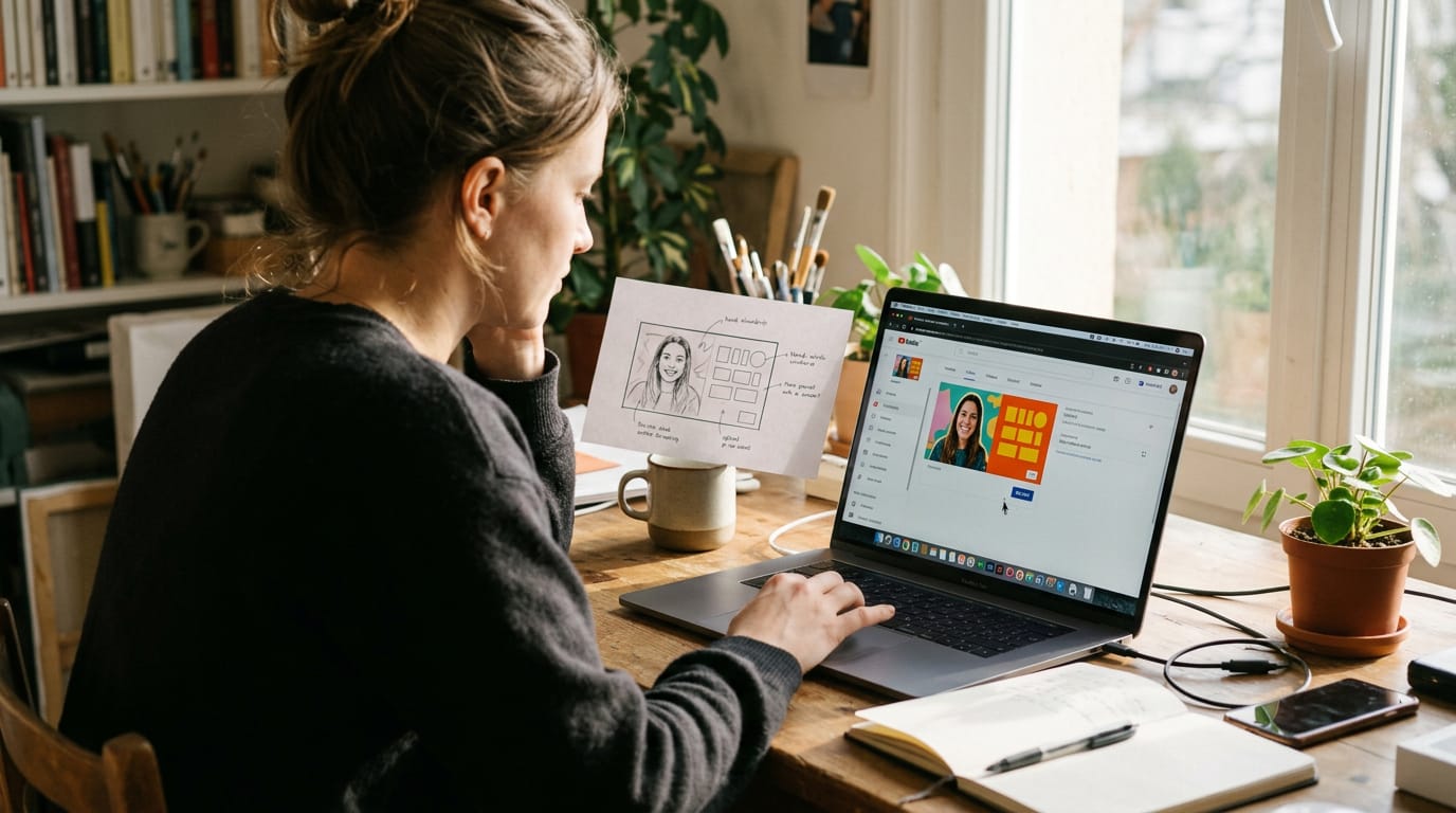
Open your video in YouTube Studio and find the thumbnail section under the description. Click the upload file button, pick your image, and check the preview before you publish. Changed your mind later? You can swap it anytime.
Best Practices for Thumbnail Design
A good thumbnail works like a small poster with one job: earn the click. Get the design right and it does that work for every video you publish.
Use contrast and color wisely
Your thumbnail competes with dozens of other images on a crowded screen, so it needs to stand out. Pair a bright background with a dark subject, or the reverse, so the eye lands on your face and title first.
Choose text colors that contrast with the background, such as white or yellow over deep blue, rather than close shades that blur together.
Add one bold, eye-catching element, like an arrow or a colored box, but keep it to one so it doesn’t compete with your face.
Make text readable at small sizes
Most people see your thumbnail as a small rectangle, not a full-size image. Keep text large and bold, and use a single concise title of a few words instead of a sentence.
Before you publish, shrink the preview to phone size and check whether you can read it at a glance. If you can’t, it’s too small. Then run Test & Compare, YouTube’s tool for A/B testing thumbnails, to see which version actually gets more clicks.
Pick images that match your video
Use high-quality photos where your face is sharp, well lit, and in focus. Think of a home cook filming a weeknight pasta recipe in a kitchen corner who shows the finished plate with warm light on it, instead of a blurry shot taken from across the room.
Match the thumbnail to what viewers will actually get, because misleading images lead to quick clicks followed by fast exits. Good lighting is what makes a usable still.
When you set a key light at face height and check the frame while you film, the thumbnail is already there.
Stay consistent with your branding
Viewers recognize channels by repeated style. Use the same fonts, colors, and layout across videos, and add one distinctive element, like a signature frame color or a logo corner, so your thumbnails look like they belong together in a feed.
Keep the design simple and clean
Leave whitespace around your subject so the image breathes. Avoid clutter: one subject, two short text lines, and a clear background is usually plenty. A clean, professional look reads as credible at a glance, and it stays readable on a small screen.
Compose for both mobile and desktop
Center your subject and text, since mobile apps trim more from the edges. Account for a tighter mobile crop and keep faces and words away from the outer edges so nothing gets cut off.
Frame your shots with the thumbnail crop in mind while you film, not after. Also keep the bottom-right corner clear. The video’s duration and progress bar sit there, so keep text and faces out of that safe zone where they’ll overlap.

Thumbnail Styles That Work Well
Most thumbnails fall into a handful of styles, and each one asks something different of your footage. Here’s how the common ones work.
Bold text layered on an image
The most popular approach is text layered on a background image: a close, well-lit shot of you or your subject with a few big words sitting over it.
It’s a clear style because the face gives viewers a person to connect with, and the text tells them the topic at a glance. Take a home cook filming in a corner of her kitchen.
She uses one shot of herself holding a finished dish and adds three bold words in the open space beside her head. Keep the face bright and the background quiet so the words stay readable at small sizes.

Combine photos into a collage
A collage stitches several images into one frame. It’s a common choice in travel vlogs, where one thumbnail might show a train platform, a street food stall, and the creator grinning in the middle. Each panel teases a different moment in the video.
Every panel competes for attention, though, so fewer panels, each sharp and well-lit, usually beat a crowded grid.
Use arrows to point things out
An arrow is a simple graphic that points at the one thing you want noticed. Use it to aim at the subject, a product on the desk, or a surprising detail in the frame. It builds viewer interest by asking a quick question without words.
A podcast host showing off a new mic arm can add one bright arrow aimed at the mic. Place it where it doesn’t cover your face.
Keep it simple with text only
Sometimes the strongest thumbnail has no photo at all. A text-only thumbnail uses a solid background and a short, bold phrase, which gives immediate topic clarity.
A streamer posting a room setup tutorial might use one clean background with three words and nothing else. Here, less text and bigger type do the work. Clarity wins.
Common Thumbnail Mistakes to Avoid
Most thumbnail problems come from a few habits that quietly cost clicks, and they’re easy to fix.
Avoid cramming in too much text
Watch for these:
- Too much text. Two or three words that add something the title doesn’t.
- Text too small to read. If you squint at your preview, scrollers won’t read it.
- Overcrowded design. Competing images, arrows, and badges leave nothing to win the eye.
A home cook with a pasta video who packs in an ingredient list, a timer, and three arrows loses the click. One bold word and a clear shot of the finished dish reads at a glance. Less clutter, more click.
Don’t mislead viewers with images
- Stock photos unrelated to video. A polished generic image tells viewers nothing about your content.
- Mismatched expectations. A dramatic reaction over a calm walkthrough means quick clicks followed by quick exits.
A podcaster filming in a spare bedroom who uses a glamorous stock studio shot attracts the wrong crowd. A real frame from the episode brings in viewers who stay.
Skip YouTube’s automatic thumbnails
- Relying on YouTube’s auto thumbnail. The frames it picks are often blurry or mid-blink.
- Missed click opportunity. A random frame gives up the one shot you design for the feed.
A streamer whose auto frame catches a mid-yawn face could have had a well-lit still shot on purpose. Plan it while filming, and the thumbnail is ready when the video is.
A thumbnail that’s the right size and shot well from the start saves you time and keeps your videos looking sharp wherever they appear.
Get the dimensions right, check how the image reads at small sizes, and light your subject while you film so the still already works.
The camera records what the light gives it, so give it good light and the thumbnail takes care of itself.
References
- YouTube thumbnail size and specs (updated for 2026) — thumbnailbench.com (2026)
- Add custom thumbnails on YouTube - Computer — support.google.com
- Channel banner & profile picture tips — support.google.com
Questions
What is the ideal size for YouTube thumbnail in 2026?
For 2026, the recommended working size is 3840 × 2160 pixels in a 16:9 aspect ratio. Save it as a JPG or PNG and keep the file under YouTube’s 2MB limit for video thumbnails.
How can I make my image fit a YouTube thumbnail?
Resize or crop your image to a 16:9 canvas, ideally 1280 × 720 pixels for a practical target. Use auto-fill or crop to fill the frame, avoid stretching faces, and add padding if you need the entire image visible. Keep important text and faces away from the edges and the bottom-right corner.
Is YouTube thumbnail 1280x720 or 1920x1080?
Both sizes work because they use the same 16:9 aspect ratio. The recommended larger working size is 3840 × 2160, while 1280 × 720 is a practical target and 1920 × 1080 is a smaller full-HD option.
Sources
- Add custom thumbnails on YouTube - Computer - YouTube Help, support.google.com
- YouTube thumbnail size and specs (updated for 2026), thumbnailbench.com,
- Channel banner & profile picture tips - YouTube Help, support.google.com
- A/B test titles & thumbnails - YouTube Help, support.google.com,